

Work in a wide RGB space, soft-proof with the printer’s ICC profile, and export with that profile embedded as PDF/X. That sequence, in that order, produces the most predictable color you’ll get without standing over the press yourself. I’ve watched too many good shoots get ruined by a rushed export, and almost every time, the fix would have taken five extra minutes.
Here’s the immediate roadmap:
- Calibrate your monitor before you judge anything on screen.
- Soft-proof against the specific paper and printer profile, not a generic CMYK default.
- Embed the target profile at export and disable color management in the print driver.
- If a client needs an exact brand color, specify it as a Pantone spot and request a physical contract proof before the full run.
Spot colors are the one place where “close enough” isn’t good enough, and no amount of soft-proofing replaces a printed sample in your hand.
Key Takeaways
Accurate print color depends on soft-proofing against the correct paper and printer ICC profile, then embedding that profile and disabling driver color management at export.
| Point | Details |
|---|---|
| Calibrate first | Use a hardware calibrator monthly in busy studios before trusting any on-screen color judgment. |
| Know the gamut gap | CMYK covers roughly 55 to 60% of the RGB gamut, so neons and electric blues shift the most. |
| Match profile to paper | Coated and uncoated stocks need different profiles; request the printer’s exact press-condition profile. |
| Soft-proof before printing | Load the paper’s real ICC profile, simulate paper and ink, and check gamut warnings before export. |
| Avoid double management | Embed the profile in your export and set the printer driver to “No Color Adjustment.” |
Table of Contents
- What a Color Profile for Print Actually Does
- RGB vs CMYK: Why Print Never Looks Quite Like the Screen
- Picking the Right CMYK Profile for Your Paper and Press
- Soft-Proofing and Rendering Intents Before You Send Anything
- Calibration, Working Space, and Bit Depth Nobody Talks About
- Exporting Without Letting Two Systems Fight Each Other
- Fast Fixes When the Print Comes Back Wrong
- A Lookbook Job That Almost Went Sideways
- Book a Shoot Built Around Getting Print Color Right the First Time
- Where to Find Real Color Profiles and Standards
- The Part of This Workflow Everyone Skips
- Sources
- FAQ
What a Color Profile for Print Actually Does
A color profile is a translation file. It tells software exactly how a specific device or paper stock renders color, so an image moves predictably from screen to press instead of by guesswork. Every camera, monitor, and printer sees color differently, and the ICC profile is what lets them talk to each other through a shared reference called the Profile Connection Space (PCS).
There are a few kinds worth knowing: display profiles (your calibrated monitor), input profiles (your camera or scanner), and output profiles (a specific printer and paper combination). Skipping the embed step is more common than you’d think, and failing to embed an ICC profile is one of the leading causes of unpredictable printed color, because the receiving device has nothing to reference and just guesses at the mapping.
- Display profile: describes how your monitor renders RGB.
- Input profile: describes how your camera or scanner captures color.
- Output profile: describes how a specific printer and substrate reproduce ink.
The technical rulebook behind all of this lives in the ICC.1 specification, and the ICC Profile Registry is where most working profiles actually live.
RGB vs CMYK: Why Print Never Looks Quite Like the Screen
RGB is light. CMYK is ink. That’s the whole reason your screen and your printed piece never match perfectly, no matter how good the printer is. RGB is additive, built from red, green, and blue light combining toward white, which is exactly how your monitor generates its glow. CMYK is subtractive, built from cyan, magenta, yellow, and black ink absorbing light off a physical page, which is a fundamentally smaller palette to work with.
The gap is bigger than most designers assume. The CMYK gamut covers roughly 55 to 60% of what a standard RGB monitor can display, which is why neon pinks, electric blues, and saturated greens are the first colors to collapse the moment you convert.
- Neon and fluorescent colors: almost always shift muddy or dull in CMYK.
- Electric blues: often lean purple or gray once printed.
- Saturated greens: tend to lose punch and shift toward olive.
If a design leans on those colors for brand identity, don’t wait until export to find out. Start the file in CMYK from the beginning, or soft-proof early and adjust the palette before a client signs off on anything.
Picking the Right CMYK Profile for Your Paper and Press
There’s no single “correct” CMYK profile. There’s only the correct profile for that paper, on that press, on that day. US Web Coated SWOP v2 has been a long-running default for coated stock, and US Web Uncoated covers, unsurprisingly, uncoated sheets. If you’re working with an offset shop that follows international standards, you’ll run into GRACoL, FOGRA, or PSOcoated profiles depending on the region and press condition.
Paper matters more than most people give it credit for. Optical brightening agents (OBAs) in bright white stocks can shift how colors read under different lighting, and a warm cream uncoated paper will pull your blacks and blues differently than a cool coated gloss. This is why a profile built for one paper stock rarely translates cleanly to another.
- Coated stock, offset press: try SWOP v2, GRACoL, or the printer’s own coated profile.
- Uncoated stock: use US Web Uncoated or an uncoated-specific profile, never a coated default.
- Digital press or wide-format inkjet: request the shop’s proprietary profile for their specific ink set and paper.
The fastest way to avoid a guessing game is to just ask. Most print shops will hand over their press-condition profile on request, and if the job is brand-critical, a contract proof from that exact paper and press combination is worth the extra day it costs.
Soft-Proofing and Rendering Intents Before You Send Anything
Soft-proofing is the step everyone knows about and almost nobody actually uses correctly. It’s the single cheapest insurance policy in this entire workflow, catching out-of-gamut shifts before they cost you a wasted print run.
- In Photoshop or Lightroom, turn on soft-proofing and load the specific printer or paper ICC profile, not a generic CMYK setting.
- Enable “Simulate Paper Color” and “Simulate Black Ink” so the screen mimics the dulling effect of actual paper and ink.
- Switch between Perceptual and Relative Colorimetric rendering intents and compare.
- Use the gamut warning overlay to spot exactly which areas are shifting, and make targeted saturation or luminance adjustments only in those zones.
- Print a small test strip covering your critical colors before committing to a full run.
Perceptual intent compresses the entire color range to fit inside the smaller CMYK gamut, which tends to preserve smooth gradients better. Relative Colorimetric keeps in-gamut colors exact and only remaps the colors that fall outside the printable range, which is usually the better call for brand colors and skin tones where accuracy matters more than smooth transitions.
Pro Tip: Soft-proofing catches out-of-gamut colors before they hit paper, but it only works if you’re loading the actual paper’s ICC profile, not a generic “CMYK” preset sitting in your color settings menu.
Calibration, Working Space, and Bit Depth Nobody Talks About
None of this soft-proofing advice means anything on an uncalibrated monitor. If your screen is drifting warm or your blacks are crushed, every color decision you make from that point forward is built on bad information. A hardware calibrator, run monthly in a busy studio, is a non-negotiable habit, not a one-time setup task.
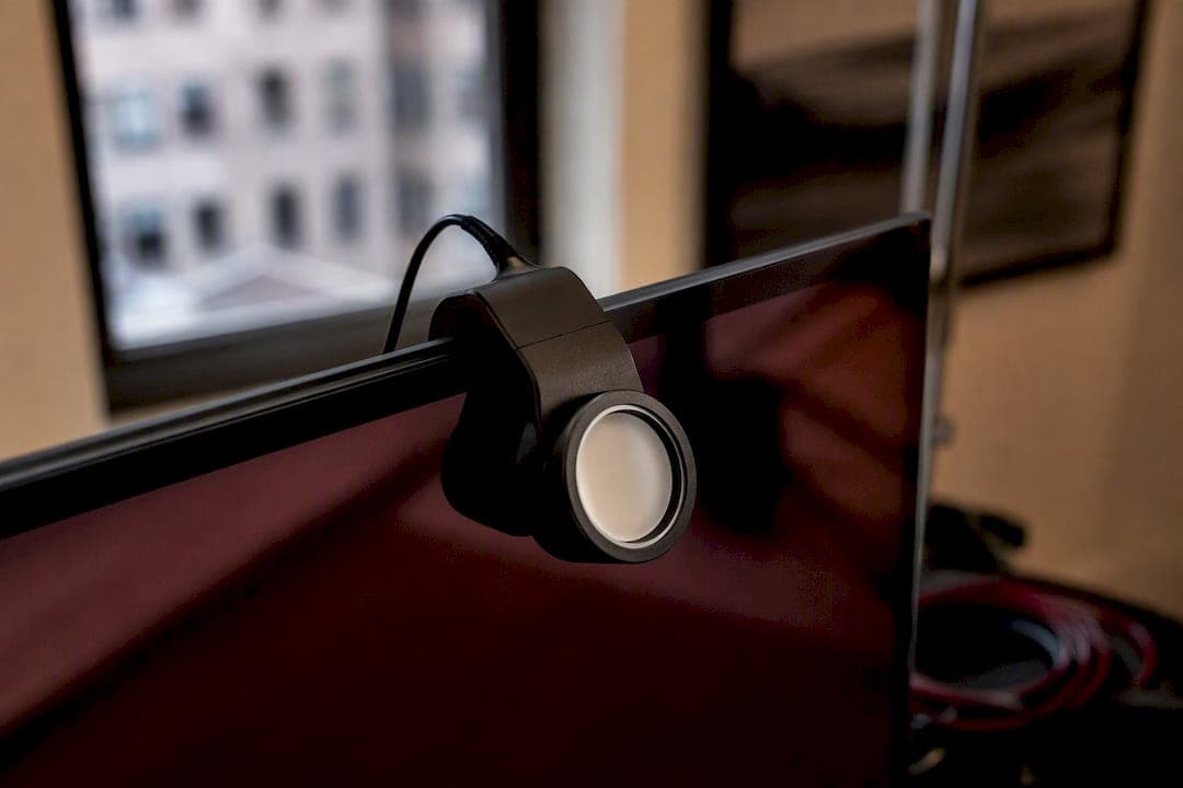
For editing, work in a wide space like ProPhoto RGB or Adobe RGB rather than sRGB, which clips too much of the range you’ll need for print conversion later. Deliver in Adobe RGB or the printer’s specific ICC, depending on what the shop requests.
Bit depth matters more than people assume. Editing in 16-bit instead of 8-bit gives you far more tonal data to work with before you flatten or convert, which shows up directly in smoother gradients and fewer banding artifacts in skies and skin tones.
- Calibrate monthly if the studio runs high volume, quarterly at minimum otherwise.
- Edit in 16-bit, convert down only at final export if the destination requires it.
- Control ambient lighting around your monitor. A window glaring off your screen will wreck your color judgment faster than any software setting.
Pro Tip: A calibrated monitor in a room with inconsistent daylight is only half solved. Close the blinds or work under consistent, neutral lighting when you’re making final color calls.
Exporting Without Letting Two Systems Fight Each Other
Double color management is the single most common technical mistake I see, and it’s invisible until the print comes back wrong. Here’s what happens: your application converts colors using the embedded profile, and then the printer driver applies its own correction on top of it. The two corrections compound, and the final print looks nothing like your soft-proof.
- Export as PDF/X-4 for press-ready files, or high-resolution TIFF when the shop specifically requests it.
- Embed the target ICC profile at export, always, never leave that box unchecked.
- In the printer dialog, set color handling to “No Color Adjustment” or “Photoshop Manages Colors,” whichever your driver labels it.
- Confirm resolution is 300 DPI and the color mode matches what the shop requested before you hit send.
- If the shop explicitly asks you to let their RIP handle conversion, send RGB and skip the manual conversion, but confirm this in writing first.
- Otherwise, application-managed color with driver adjustments turned off is the safer default nearly every time.
A one-line preflight note to your lab, stating your profile, your chosen rendering intent, the paper stock, and whether you want a proof, takes thirty seconds and saves you a reprint conversation.
Fast Fixes When the Print Comes Back Wrong
Most color problems trace back to a skipped step, not a broken tool. Run through calibrate, soft-proof, embed, test strip, in that order, before you ever question the press itself.
- Rich black looks weak: use a proper rich black formula (commonly around 60/40/40/100 C/M/Y/K) instead of relying on 100% K alone.
- Shadows are blocking up: lift shadow detail by roughly 10 to 15 points in the print copy to compensate for ink compression.
- Colors look flat overall: selectively boost saturation only in the areas flagged by your gamut warning, not across the whole image.
- Visible banding in gradients: confirm you’re editing in 16-bit, not 8-bit.
- File rejected at the lab: check for an embedded profile, 300 DPI resolution, and the correct color mode before resubmitting.
A Lookbook Job That Almost Went Sideways
We shot a fashion lookbook a few seasons back where the designer’s signature color was a deep burgundy, and the first proof came back looking almost brick red. The file had been converted using a generic CMYK setting instead of the printer’s actual paper profile, and the uncoated stock the client chose was pulling warmth into every dark tone in the set.
We rebuilt the soft-proof using the printer’s own ICC for that exact paper, adjusted the burgundy channel by eye against a physical swatch, and requested a contract proof before the full print run went out. Second proof matched. No reprint, no blown deadline, no awkward call to the client explaining why their brand color looked wrong in a hundred printed lookbooks.
The lesson stuck with our whole team: never trust a generic CMYK conversion on a job where brand color accuracy actually matters. Get the printer’s real profile, soft-proof against it, and confirm with a physical proof before committing to the full run.
Our studio handoff checklist now includes the paper stock, target ICC profile, rendering intent, and a note on any color the client considers non-negotiable, sent to the lab before a single file goes out. On-set choices affect this more than people expect too. Wardrobe color, background tone, and even the color temperature of your lighting setup all show up as flags on that same handoff note, because a lab needs to know intent, not just numbers. If you’re planning a shoot where color accuracy will matter downstream in print, our lookbook layout guide covers how we structure those decisions from the production side, and our retouching workflow breakdown shows where color calls happen before a file ever reaches export.
Book a Shoot Built Around Getting Print Color Right the First Time
If you’ve read this far, you already know the theory. What you actually need is a production partner who treats color accuracy as part of the job, not an afterthought handled after the invoice is paid. That’s the standard we hold every shoot to at Ken Jones Photography, KenJonesNYC, Ken Jones NYC, whether it’s a fashion editorial headed for a printed lookbook or a beauty campaign going straight to a brand’s print collateral.
Our studio in Manhattan’s Financial District handles the full chain, from lighting and wardrobe direction through retouching and final file delivery, with color management built into every stage rather than bolted on at the end. If your next project depends on colors that print exactly the way they looked on set, take a look through our fashion photography portfolio or reach out through Kenjonesnyc to talk through what your print run actually needs.
Where to Find Real Color Profiles and Standards
The ICC Profile Registry hosts registered profiles for standard printing conditions, including GRACoL and PSOcoated variants, and is the fastest place to download a real press profile instead of guessing.
- ICC.1 specification: the technical document defining profile format and rendering intents.
- ICC Profile Registry: downloadable profiles for standard press and paper conditions.
- Your printer or lab’s own profile page: always ask directly if it isn’t posted publicly, most shops will send it on request.
- Adobe’s soft-proofing documentation inside Photoshop and Lightroom’s own help resources for step-by-step setup.
The Part of This Workflow Everyone Skips
Most articles on this subject treat color management like a checkbox exercise, and that’s where the advice falls short. The real failure point isn’t ignorance of ICC profiles, it’s impatience. Designers know soft-proofing exists. They skip it anyway because a deadline is tight and the screen “looks fine.”
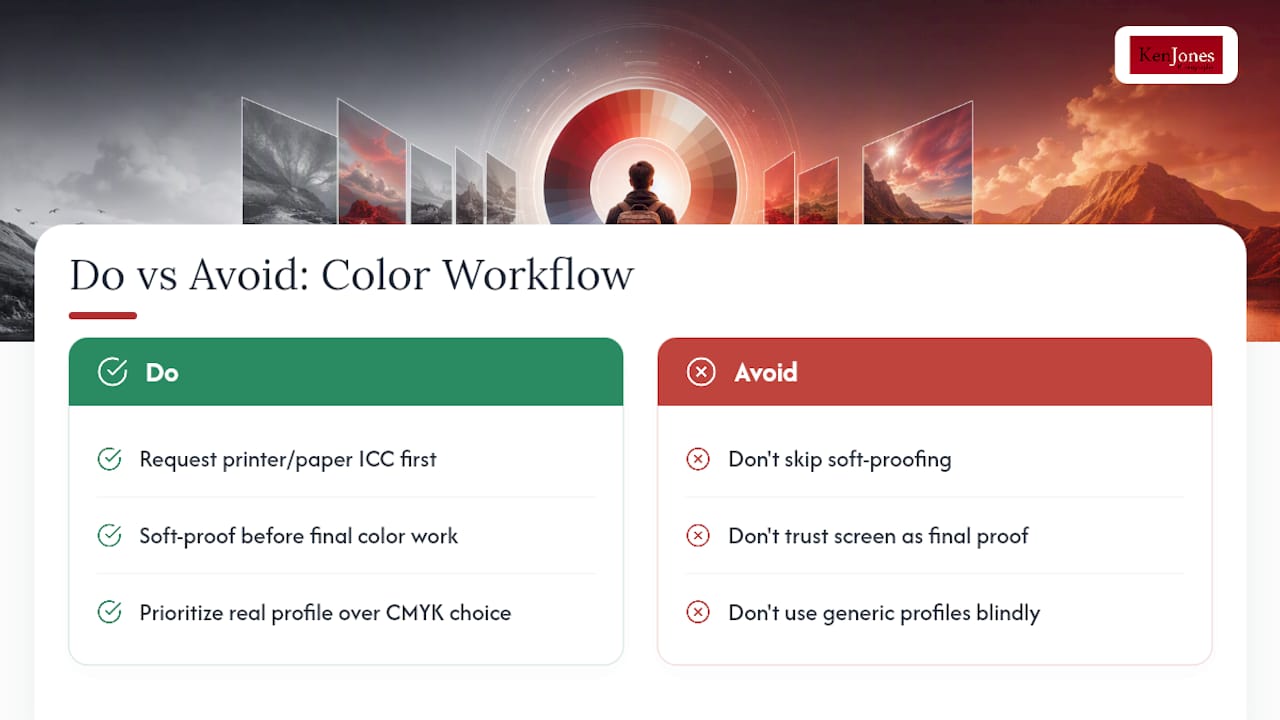
That’s backwards. The screen looking fine is exactly the problem, because your monitor was never going to show you the printed result unless you specifically told it to simulate the paper and ink. The five minutes soft-proofing takes is nothing compared to the days lost reprinting a run because a client’s signature color came out wrong.
If I had to prioritize one habit above all the others in this piece, it wouldn’t be picking the “best” CMYK profile. It would be building the habit of requesting the actual printer or paper ICC before you ever open a file for final color work. Generic profiles are a guess. A real profile from the actual press and paper is a fact. Everything else in this workflow, from rendering intent to shadow lifts, is fine-tuning around that one decision.
— Ken
Sources
- RGB vs CMYK presentation — Los Rios (Driscoll)
- Why colour profiles are essential for printing — Graphic Arts Australia
FAQ
What color profile is best for print?
There’s no universal best profile. The right choice is the specific ICC profile for your printer and paper combination, such as a press’s GRACoL or SWOP v2 profile for coated stock, requested directly from your print shop whenever possible.
Should I use CMYK or RGB for printing?
Convert to CMYK using your printer’s specific profile before final output, since CMYK’s gamut covers roughly 55 to 60% of RGB’s range, though some digital presses accept RGB and convert it themselves in their RIP.
How can I tell if my image is CMYK or RGB?
In Photoshop, check the title bar or go to Image > Mode to see the current color mode, and in Lightroom, check the file’s color space setting under the histogram panel in the Develop module.
Which CMYK profile should I use?
For coated offset stock, US Web Coated SWOP v2 or GRACoL are common starting points, while uncoated jobs need US Web Uncoated, but always confirm with your specific printer since many labs publish their own press-specific profiles that outperform generic defaults.