
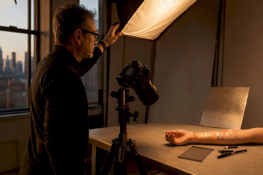
For sale-ready cosmetic swatches, the single most reliable method combines a neutral, diffused key light, a swatch application technique you repeat exactly the same way every time, and a color-reference frame shot before you touch the product. Get those three right and everything else, backgrounds, camera settings, editing, becomes a matter of taste. Skip any one of them and you’ll spend hours in post trying to fix what a five-minute setup change would have solved on set.
TL;DR:
- Consistent application and exact setup—using a neutral reference frame—are essential to prevent color shifts and reduce post-production fixing time.
- Proper lighting includes a diffused key source at 45 degrees, with a reflector for even fill and a low-positioned, directional highlight for shimmer that catches reflections properly.
- Using macro lenses between 90 to 105mm, shooting at f/8 to f/11, and maintaining fixed camera settings ensures sharp, true-to-life swatch images across multiple SKUs.
- Shooting tethered with a gray card or color target and logging lighting parameters helps maintain color accuracy and consistency throughout the shoot.
- Only bring products to a professional studio when volume, accuracy, or multi-format needs exceed in-house capabilities, especially for large SKU lines or marketplace standards.
Table of Contents
- What You Need Before You Start Shooting Cosmetics Swatch Photography
- Lighting Setups for Swatches: One-Light, Angled Key, and Shimmer Control
- Swatch Application Techniques: Smear, Swipe, and Layered Builds
- How Do You Keep Swatch Colors Accurate Across a Shoot?
- Backgrounds and Composition That Keep the Focus on Shade
- Camera Settings and Lenses for Sharp Swatch Close-Ups
- Building a Repeatable Shot List and Workflow
- Post-Production That Protects Texture and True Color
- Common Problems on Set and Real Fixes From the Studio
- File Formats and Resolution Standards for Swatch Images
- Ethical Considerations and Avoiding Misleading Color Representation
- The Texture-First Approach Beats Chasing Trends
- When It Makes Sense to Bring in a Professional Studio
- Sources
- FAQ
What You Need Before You Start Shooting Cosmetics Swatch Photography
I’ve watched plenty of talented photographers waste a full afternoon because they hadn’t checked their gray card before the client arrived. Get your gear sorted first.
A full-frame camera with manual controls is the standard, but a modern phone with manual exposure lock can work for quick reference shots or social content, just not for anything going on a product detail page. For lenses, you want something in the macro or short telephoto range, more on that later.
On lighting, continuous LED panels are forgiving for beginners because you see the result in real time, while strobes give you more punch and freeze motion better if you’re working with liquid formulas that shift. Either way, you need a diffuser, at minimum a shoot-through umbrella or a softbox, plus a white foam reflector for fill.
For surfaces and application tools:
- A frosted or clear acrylic sheet for clean, reflection-controlled swatches
- A white ceramic tile as a warmer, more tactile alternative
- Stainless palette knives and small cosmetic spatulas for consistent pressure
- A few clean synthetic brushes for powder and eye shadow work
Round out the kit with a gray card or a ColorChecker target, tethering software if your camera supports it, and isopropyl wipes to keep glass and packaging free of fingerprints between takes.
Lighting Setups for Swatches: One-Light, Angled Key, and Shimmer Control
Most swatch problems trace back to lighting, not the product. Here’s the sequence I run on almost every beauty job at the studio.
- Start with one softbox, roughly 24×36 inches, at 45 degrees to your surface and about three feet away. This gives you even, shadow-free coverage for matte formulas and honest color across the frame.
- Add a white reflector opposite the key to fill shadows without introducing a second color temperature.
- For shimmer or glitter formulas, swap in a smaller, harder source, a bare speedlight or a small grid spot, positioned low and raking across the swatch. This catches the reflective particles instead of flattening them.
- Move the light in small increments rather than moving the product. The sparkle only pops at specific angles, and once you find it, lock the stand down.
- Use black flags or negative fill on the opposite side to deepen shadows and pull out texture in cream and balm formulas.
Texture is the entire commercial argument for beauty photography. A lighting choice that flattens a cream into something that looks like flat paint costs the client sales, because buyers judge finish and payoff from the photo alone. Treat shimmer like a mirror. You’re not lighting the product, you’re lighting for the reflection it throws back, and that means moving the source until the catch light lands where you want it.
Pro Tip: Shoot a test swatch at three or four light angles before committing to the full run, and keep a phone photo of the winning setup, including light height and distance, so you can rebuild it exactly on the next SKU.
Swatch Application Techniques: Smear, Swipe, and Layered Builds
The application method you choose says as much about the product as the lighting does. A smear, dragged with a palette knife or spatula, shows off body and viscosity, essential for foundations, primers, and anything marketed on texture. A single swipe with a finger or sponge gives instant, honest payoff, the shot most brands want for their hero image. A layered swipe, two or three passes in the same spot, demonstrates buildability, which matters enormously for concealers and buildable eye shadows where customers want to know if one pass is sheer or full coverage.
These variations are standard technique in professional cosmetics photography because each shows a different, commercially relevant product attribute. The tool matters too:
- Palette knife strokes produce clean, graphic edges good for e-commerce
- Fingertip pressure creates a softer, more human-feeling smear, better for editorial
- Brush passes show texture the way a customer will actually apply the product, useful for powders and cream blushes
If you’re shooting on-skin swatches, prep the arm or hand with a light cleanse, no lotion, no residue, and always include a neutral, untouched patch of skin in frame as a reference point, as recommended in this Lifestyle product photography guide. Diverse skin tone testing on the same product avoids the kind of shade misrepresentation that generates return requests and bad reviews. On-surface work with acrylic or tile is the better choice when you need catalog consistency across dozens of SKUs, since skin tone variation between models introduces a variable you don’t want in a straight comparison grid.
How Do You Keep Swatch Colors Accurate Across a Shoot?
Color drift is the most common complaint I hear from beauty brands who tried shooting swatches in-house before calling the studio. The fix is procedural, not artistic.
- Shoot a gray card or ColorChecker target as your first frame, under the exact lighting you’ll use for the rest of the session, and build a custom camera profile from it if your software allows.
- Avoid mixing window light with your studio source. Daylight running at roughly 5600K next to a tungsten-balanced continuous light will shift color across a single frame in ways no amount of Photoshop cleanly fixes.
- Lock white balance manually, either in-camera or in your tethering app, and don’t touch it again until the light changes.
- Shoot tethered so you can compare the on-screen image against the physical swatch in real time, not after the model has gone home.
- Log your lighting distances, power settings, and white balance Kelvin value for every SKU family so the next shoot starts from a known baseline instead of guesswork.
Marketplace and catalog work depends on this discipline. Resolution minimums and consistent lighting are treated as non-negotiable requirements by most e-commerce platforms, and a shade that photographs warmer or cooler than reality is one of the fastest ways to generate return requests on a foundation or concealer line.
Backgrounds and Composition That Keep the Focus on Shade
Background choice should answer one question: is this going on a product page or in an editorial spread? For e-commerce, a neutral white, gray, or soft pastel background keeps the eye on the swatch and satisfies most marketplace listing requirements. For editorial or social content, a subtle contextual prop, a piece of raw silk, a marble corner, a sprig of dried flora, adds mood without stealing attention from color accuracy.
A few composition rules I hold to on every job:
- Keep single-swatch shots centered with generous negative space for cropping flexibility
- For shade lineups, use consistent spacing and identical camera position across every frame so the row reads as one continuous strip
- Skip glossy or metallic props near the swatch. Reflective surfaces bounce color casts onto the product and quietly shift what the customer perceives as the actual shade
- Use a shallower depth of field to isolate texture, but keep enough of the frame in focus that scale and proportion still read clearly
Camera Settings and Lenses for Sharp Swatch Close-Ups
A macro lens in the 90 to 105mm range is close to the industry default for swatch work, and for good reason. That focal length gets you near 1:1 reproduction with minimal distortion, so a lipstick swipe reads at true proportion instead of looking stretched or barrel-warped the way a wide lens would render it.
- Shoot between f/8 and f/11 for most swatch work. That range gives enough depth of field to keep an angled smear sharp edge to edge without diffracting detail away at f/16 or smaller.
- Keep ISO at its native base setting, usually 100 or 200, and let your lighting do the work instead of pushing sensitivity and adding noise to a texture shot.
- If you’re using strobes, stay at or below your camera’s sync speed, commonly 1/200 or 1/250 second, to avoid banding across the frame.
- Shoot RAW, always. A JPEG bakes in a white balance decision you can’t undo later, and swatch work lives or dies on your ability to correct color after the fact.
Building a Repeatable Shot List and Workflow
Consistency across a multi-SKU shoot doesn’t happen by accident. It happens because someone wrote down the plan before the first light turned on.
- Build your shot list before the shoot: single swipe, layered swipe, blended edge, a texture close-up, and a full shade lineup for each product. That five-shot pattern covers nearly every use case a brand will need from packaging to paid ads.
- Name files with the SKU number and shot type baked into the filename, not just “IMG_4471,” so retouchers and marketing teams can match images to products without opening every folder.
- Shoot a fresh reference frame with your gray card every 10 to 15 products. Studio lights drift slightly as they heat up, and catching that early saves a painful color-matching session later.
- Before wrapping, review images at 100% zoom for tint shifts between batches, focus accuracy on the texture, and stray fingerprints on glossy packaging.
Post-Production That Protects Texture and True Color
Editing swatch photography is mostly about restraint. The goal is accuracy, not a stylized look that flatters the image but misrepresents the product.
- Start every batch by applying your camera profile or a custom ICC profile built from your ColorChecker frame, then use tethered previews from the shoot to sanity-check the result on screen.
- Batch-correct exposure and white balance using your reference frames as the anchor, then go file by file for fine adjustments, since even a controlled set will have minor exposure drift between products.
- Retouch minimally. Remove dust, lint, and fingerprints, but never smooth away the pigment texture or shimmer particles that are the entire point of the shot.
- Export at the resolution and color space required by the retailer or marketplace you’re delivering to, since requirements vary by platform and a rejected upload costs everyone time.
Pro Tip: Keep an unedited RAW and a finished export side by side during your final review. If the two don’t look like the same product under the same light, you’ve retouched past the line.
Common Problems on Set and Real Fixes From the Studio
Most swatch photography problems I see from brands who tried shooting in-house trace back to one root cause: mixed lighting sources they didn’t realize were fighting each other. A skincare client once brought in a batch of serum swatches shot near a window with a desk lamp filling shadows, and every image had a faint yellow-green cast that no amount of curve adjustment could fully remove. We reshot under a single diffused source and matched every SKU to a locked white balance, and the entire catalog became usable in one afternoon instead of three.
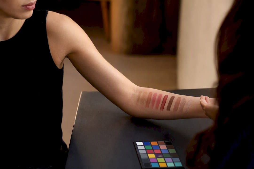
The other repeat offender is inconsistent swatch pressure, one product smeared thick, the next barely touched, which makes a shade lineup look like five different formulas instead of one line in five colors. The fix is procedural: one person applies every swatch in a run, using the same tool and the same motion, so payoff stays comparable frame to frame.
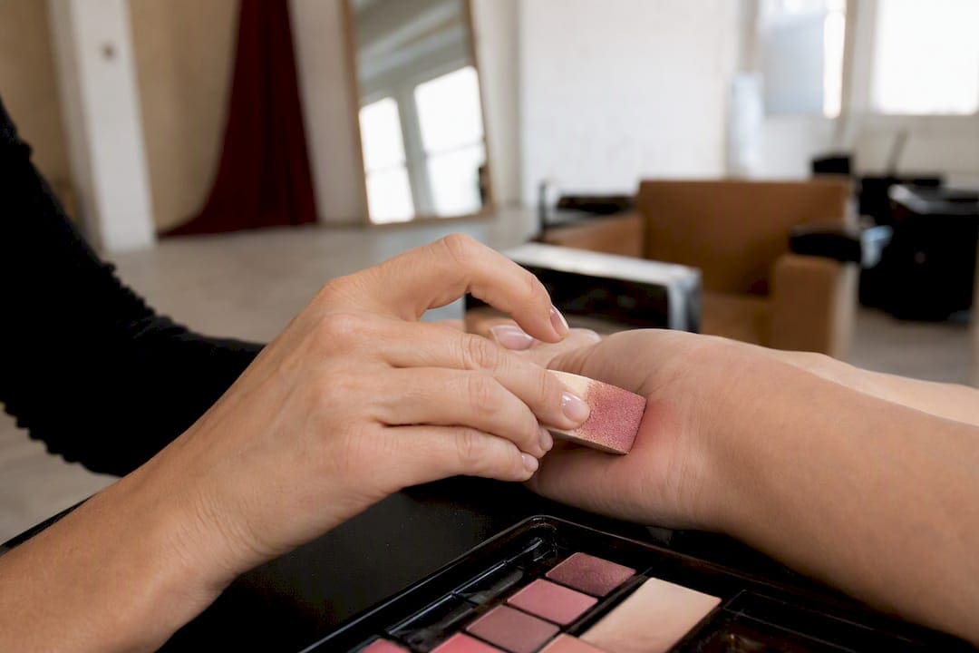
For multi-SKU runs, we document a full lighting and application recipe, distances, power settings, applicator type, so a brand’s next seasonal drop matches the last one exactly. You can see that consistency across our beauty photography portfolio, and the lighting and retouching breakdown on our blog goes deeper into the technical side of this work.
File Formats and Resolution Standards for Swatch Images
Shoot RAW on set, always, but the deliverable format depends on where the image ends up. For your master archive, keep a full-resolution TIFF or high-quality PSD with layers intact, since you’ll likely need to re-export for a new platform down the line. For web and marketplace use, JPEG at 80 to 90% quality strikes the right balance between file size and the fine detail a shimmer swatch needs to read correctly on screen.
Resolution matters more than most brands realize until a listing gets flagged. Most major marketplaces require a minimum long-edge dimension, commonly 2000 pixels or more, so zoom features can render texture without pixelation. Shoot at your camera’s full resolution and downsize for delivery rather than shooting small and trying to upscale later, since upscaling a swatch image tends to smear fine shimmer particles into mush.
Color space is worth locking down early too. sRGB is the safe default for anything going on a website or third-party marketplace, since most consumer monitors and shopping apps render sRGB accurately and Adobe RGB files can appear oversaturated or shifted on devices that don’t manage color space correctly. Save Adobe RGB or ProPhoto RGB versions only for print catalogs where a professional print house will handle the conversion.
Ethical Considerations and Avoiding Misleading Color Representation
A swatch photo is a promise to the customer about what they’ll get in real life, and that promise carries real weight for foundation, concealer, and any shade-matched product. Skin tone accuracy is commercially critical here, because a camera and sensor combination can quietly bias certain skin tones warmer, cooler, or grayer than they actually appear, and verifying against a physical reference under standard viewing conditions is the only reliable check.
The practical fix is using color targets that include a range of skin tone patches, not just a neutral gray card, and testing your final images against the physical product in daylight-balanced viewing conditions before anything ships to a retailer. Brands that skip this step tend to find out the hard way, through return rates on foundation lines or comment sections calling out a shade that looked nothing like what arrived.
There’s also a line between enhancing an image and misrepresenting a product. Boosting contrast or sharpening for clarity is normal production work. Pushing saturation to make a muted lipstick look more vibrant than it is, or brightening a swatch until the true undertone disappears, crosses into misleading advertising territory, and it erodes the kind of customer trust a beauty brand spends years building.
The Texture-First Approach Beats Chasing Trends
Most advice on cosmetics swatch photography treats lighting and color as the whole story, and that’s backwards. Color accuracy keeps you out of trouble with returns and marketplace rejections, but texture is what actually sells a product. A viewer scrolling past a foundation swatch decides in about a second whether that formula looks dewy, matte, or chalky, and that judgment happens before they consciously register the shade at all.
The overrated piece of conventional wisdom is the obsession with perfectly flat, shadowless lighting for everything. That approach kills shimmer, flattens cream texture, and produces images that are technically accurate and commercially forgettable. Where the real work happens is in the small adjustments, moving a hard source three inches to catch glitter properly, choosing a palette knife smear over a finger swipe, because the client’s serum needs to show viscosity, not payoff.
If you take one thing from this article, prioritize repeatability over cleverness. A documented lighting and application recipe that produces the same honest result on SKU forty as it did on SKU one is worth more to a brand’s catalog than any single striking image.
— Ken
When It Makes Sense to Bring in a Professional Studio
Shooting a handful of swatches on a home setup works fine for a hobby account or a quick social post. It stops working the moment you’re managing more than a dozen SKUs, need shade-accurate images a retailer will actually accept, or want editorial frames alongside your catalog shots. That’s the point where the math shifts toward hiring a studio instead of losing days to reshoots and color corrections.
Ken Jones Photography, KenJonesNYC, Ken Jones NYC, runs full swatch and beauty sessions built around exactly the repeatability this article covers, documented lighting recipes, locked color profiles, and consistent application across every SKU in a run. Services relevant to a swatch shoot include full studio rental in the Financial District, complete production support, and catalog-ready e-commerce product photography delivered with retouching and export settings already matched to marketplace requirements.

Before requesting a quote, pull together your SKU count, any brand color guidelines or Pantone references, and a sense of whether you need pure e-commerce shots, editorial frames, or both. Reach out through Kenjonesnyc to get a session scheduled and put a real, repeatable swatch workflow behind your next catalog.
Sources
- Makeup Product Photography – How to Plan, Shoot, and Optimize Stunning Cosmetic Images | SellerPic
- How to Capture Texture: Photographing Creams, Serums, and Makeup Swatches – Gourmet Chick
- Cosmetics & Beauty Product Photography: Complete Guide
- How to Photograph Cosmetics and Beauty Products — That Toronto Studio
FAQ
What Is the 20-60-20 Rule in Photography?
It’s a lighting ratio guideline suggesting roughly 20% of a frame in highlights, 60% in midtones, and 20% in shadows to create balanced exposure. For swatch work, it’s a useful starting point but secondary to matching your key light to the finish, matte, cream, or shimmer, of the specific formula.
How Much Does a Makeup Artist Charge for a Photoshoot?
Rates vary widely by market and experience level, and there’s no single standard figure that applies everywhere. For swatch-only shoots, many brands skip the makeup artist entirely since application is handled directly with spatulas, brushes, or fingertips rather than a full face application.
What Is a Swatch in Makeup?
A swatch is a small, controlled sample of a cosmetic product applied to skin or a surface to show its true color, texture, and finish. In cosmetics swatch photography, the goal is capturing that sample accurately enough that a customer can trust it represents the real product.
What Type of Makeup Looks Best in Photos?
Formulas with a satin or subtle sheen finish tend to photograph most reliably, since they show dimension without the flat look of pure matte or the blown-out highlights that can plague heavy shimmer under direct light. That said, every finish, matte, cream, glitter, has its own correct lighting recipe rather than one universally “best” look.
This article provides general photography guidance and is not a substitute for professional production consultation for your specific brand needs.